Find a LinkedLab theme you can read comfortably
Use a real puzzle to compare colors, symbols and region boundaries, then keep the settings that make your next move easiest to see.
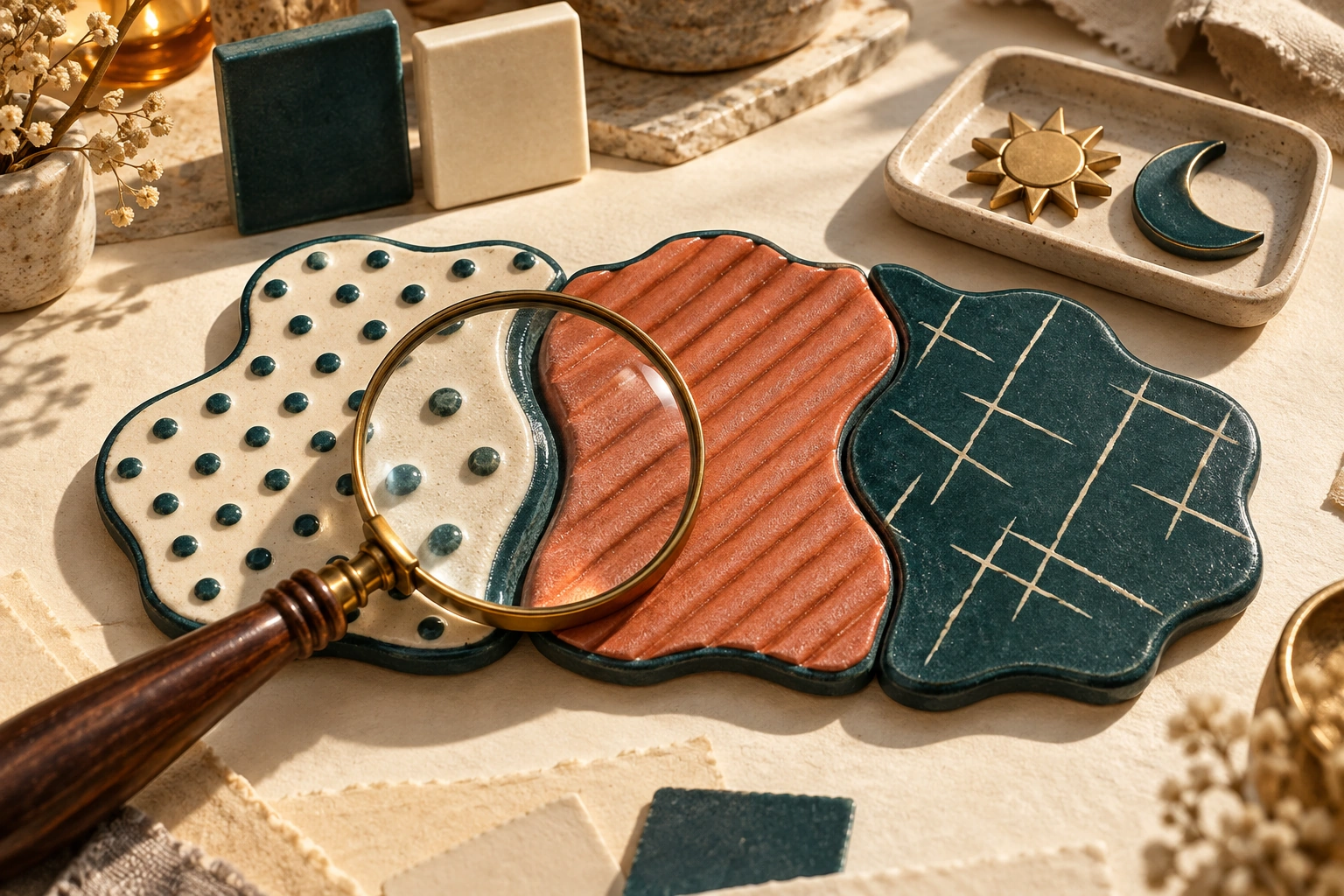
Reading
Start with the part that is difficult to see
A puzzle can feel difficult because the deduction is tricky, or because two regions look similar. Before changing difficulty, identify the visual problem: small clues, unclear boundaries, distracting artwork or movement that pulls attention away from a cell.
LinkedLab's Apple version 3.3 adds theme choices including Classic and High contrast. This guide offers a way to test them on your own screen. Valorem Apps publishes LinkedLab and this guide; the steps are suggested checks, not a claim that any theme suits every player.
Compare two themes on the same kind of board
Open the paint button inside a game to revisit the style choices. Start with Classic if you prefer plain crown symbols and familiar colors. Compare it with High contrast if separating the board's elements is your main concern.
Use the same puzzle family and similar screen brightness for both looks. Judge the information you need for a move rather than the decoration around it. Can you locate a clue immediately? Can you follow a boundary without tracing it several times? Does a placed symbol remain distinct from an empty cell?
Change one choice at a time. Trying a different theme, appearance and difficulty together makes it harder to tell which change helped.
Use a short check for each puzzle family
A theme that looks clear on one board may deserve another look on a different family. Work through these checks before settling on it:
- Clusters: follow a rectangle's edge from corner to corner. Make sure the clue remains readable when the surrounding area is selected.
- Synapse: follow the drawn route through a bend. Check whether the next numbered checkpoint remains obvious near the path.
- Polarity: distinguish each sun from each moon, then inspect the smaller clues between cells. A clear large symbol does not guarantee a clear small clue.
- Isolates: trace the colored region containing a queen. Confirm that its border and neighboring cells remain distinguishable after placement.
Check patterns as well as colors
The Apple listing describes region patterns and clear outlines alongside its palettes. When two colors look alike to you, inspect whether those additional marks let you follow their boundaries. Use a small area first: pick three neighboring regions and trace each separately.
If you lose the boundary, try another look before attempting a harder board. Monochrome or another palette may be worth comparing, but a name alone cannot tell you whether the combination of patterns, outlines and symbols works for your eyes.
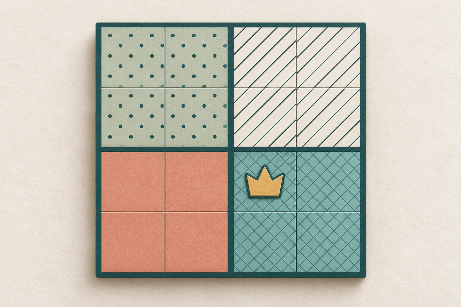
Adjust appearance and movement separately
Themes work with light and dark appearances, and changing the style preserves your appearance choices. Compare those appearances in the place you usually play. A choice made at a bright desk may feel different during an evening session.
For a quieter presentation, try a simple theme with static menus. The listing also describes Calmer effects and support for device Reduce Motion and larger-text settings. After changing text size, reopen a board and check both the main symbols and the smallest instructions. These controls are options to evaluate; they are not a substitute for checking the actual board.
Keep a useful result or report a precise problem
Once you find a comfortable combination, keep it for a few sessions before comparing again. Your goal is to recognize the board consistently, without having to relearn its visual cues each day.
If a problem remains, describe it concretely when contacting support: the puzzle family, chosen theme, light or dark appearance, device and the element that is hard to distinguish. For example, explain that a boundary disappears beside a placed queen. That is more actionable than saying the entire screen is unclear.
Do these settings apply to Android?
This guide covers the Apple listing checked at version 3.3. Android has a separate edition; do not assume its settings or theme names match.
Is High contrast always the best option?
No single theme is best for everyone. Compare the clues, boundaries and placed symbols on the screen you actually use.